Categories
Uncategorized

High Point Market 2022 and the trends for 2023

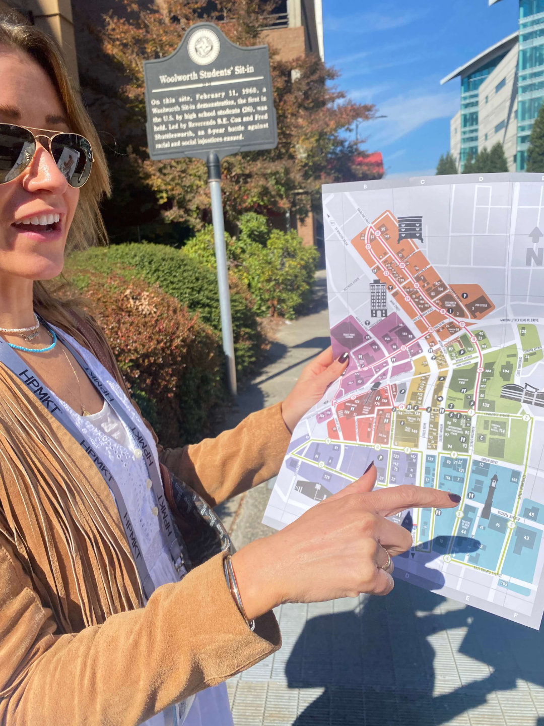
We recently had a trip to visit High Point Market in North Carolina, the world’s biggest interiors expo. We have been following the posts from the Market over the years, but nothing prepares you for the sheer size of the event. High Point Market is the size of a town and every building is filled with furniture and interior design showrooms. We spent 4 days walking around the showrooms and still didn’t manage to see everything. The hospitality was fantastic and we were made to feel very welcome.

We wanted to go to High Point for inspiration, spot new trends and meet potential new suppliers. Our heads are still buzzing with the sheer scale of the event and the number of things we loved.  

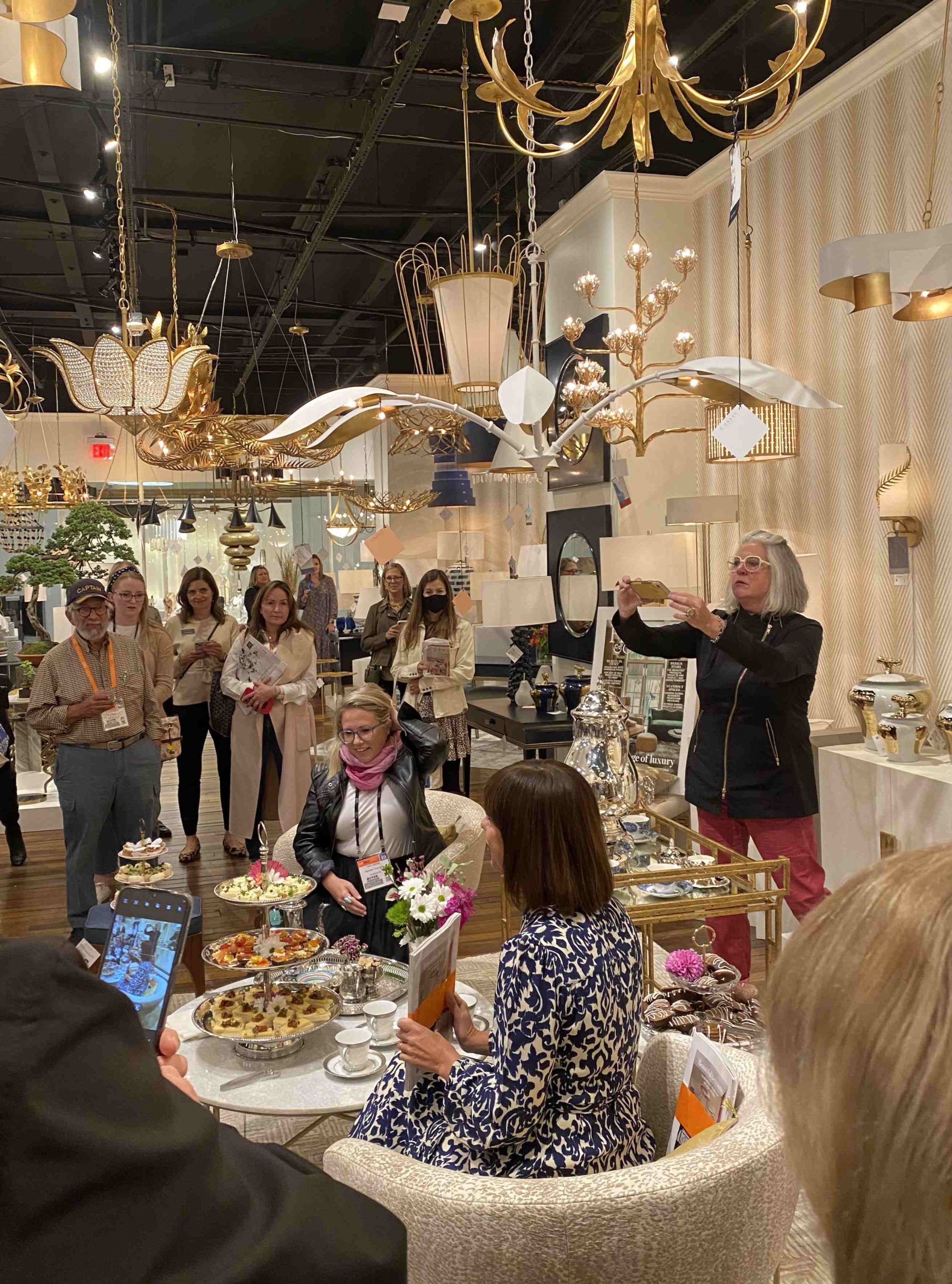
We had a great start on day 1 with a visit to the Currey & Co showroom for British high tea with a fellow Brit Lucy Searle, editor of Homes and Gardens.  It was a fantastic start and nice to meet a fellow newbie to the event, who also looked overwhelmed by the sheer size and scale.  

Listed in no particular order, these are the materials, shapes, styles and themes emerging this year and into 2023. I took hundreds of photos and this is only a small snapshot.

Rope and Rattan

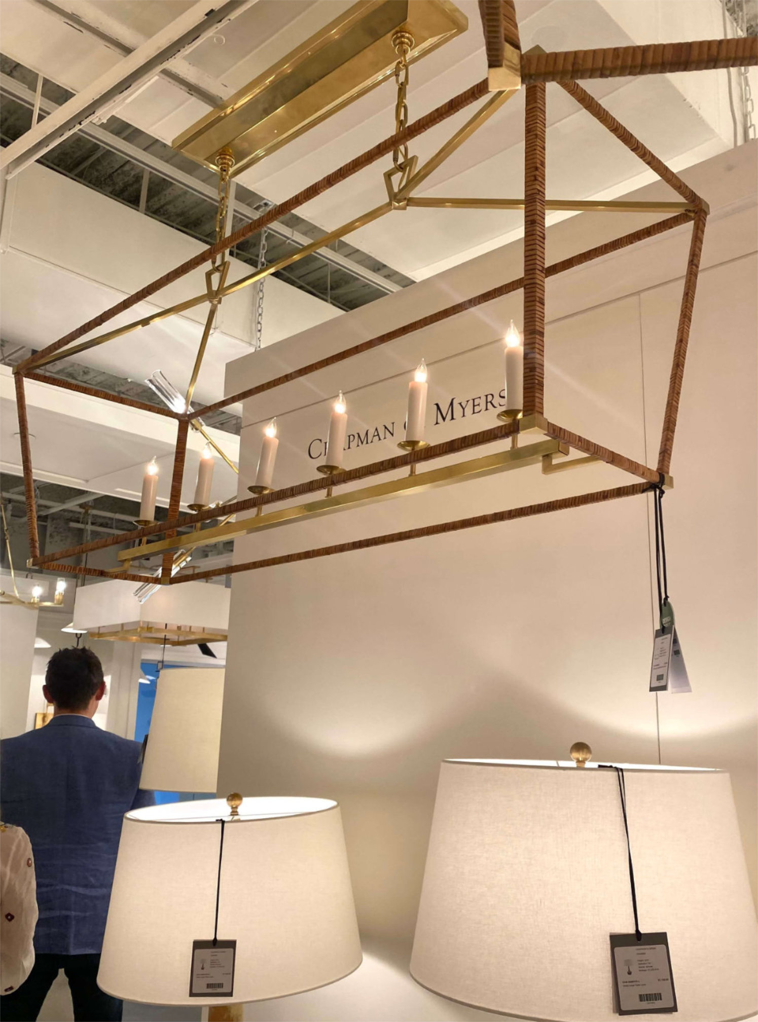
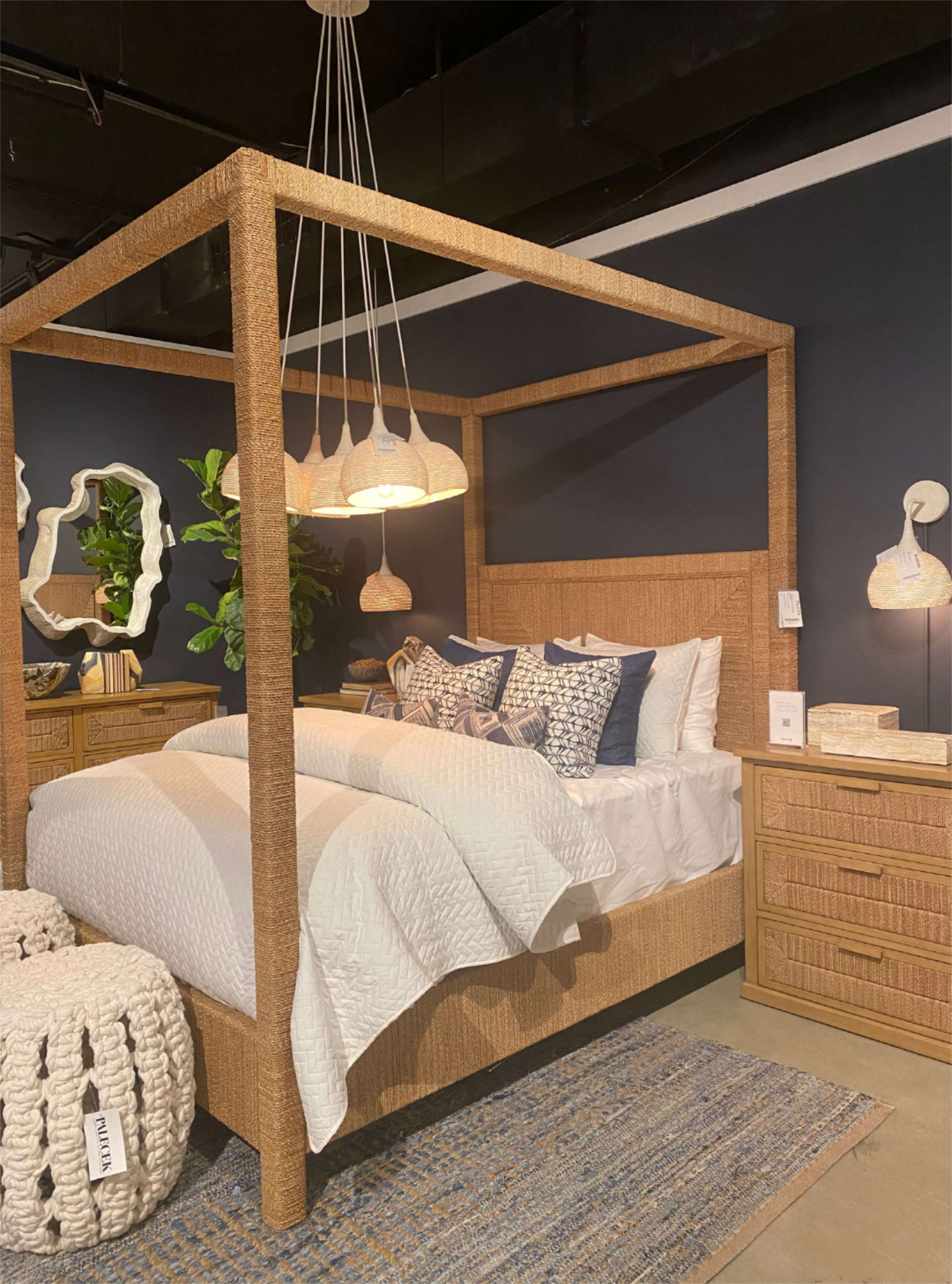
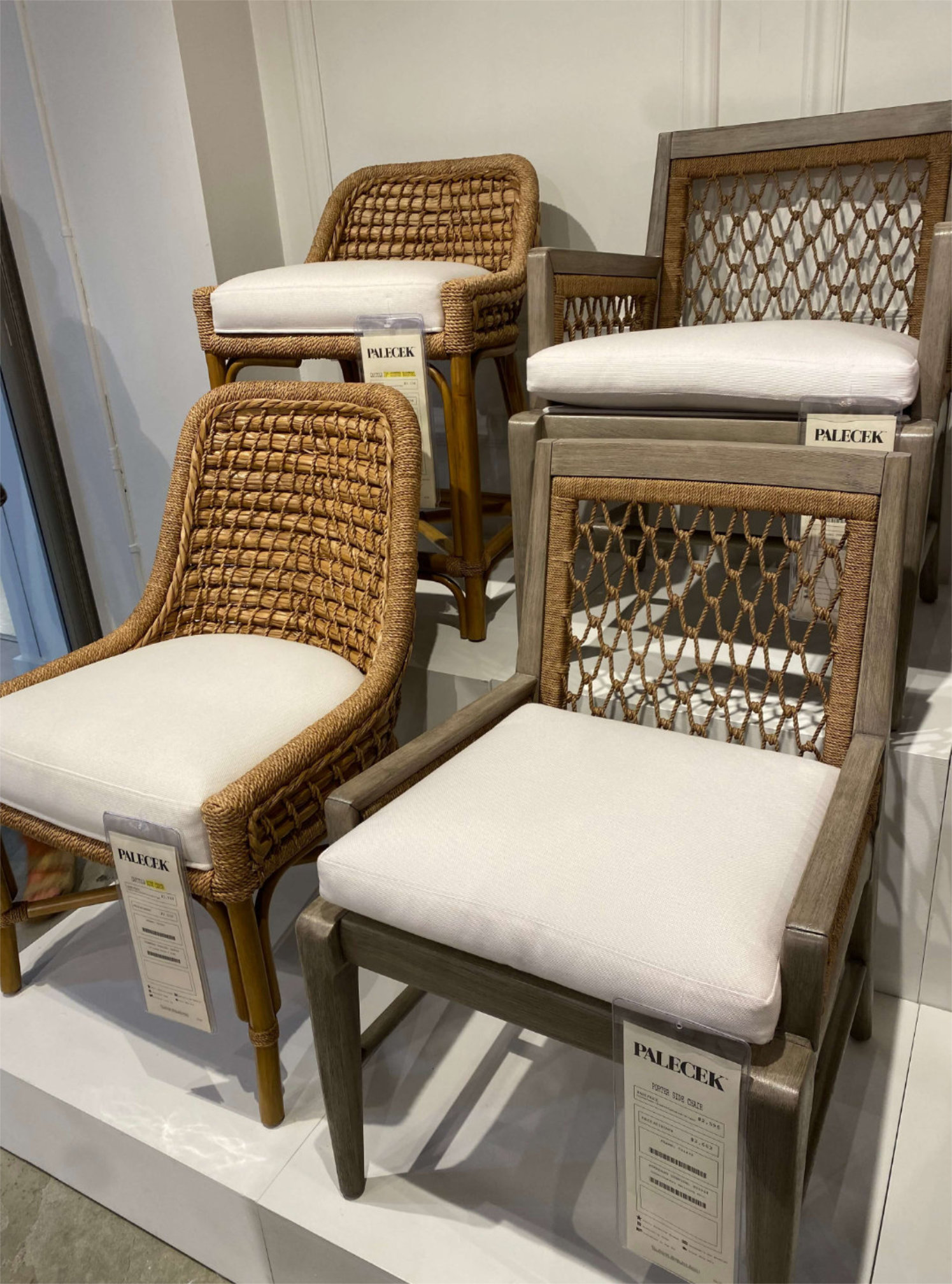
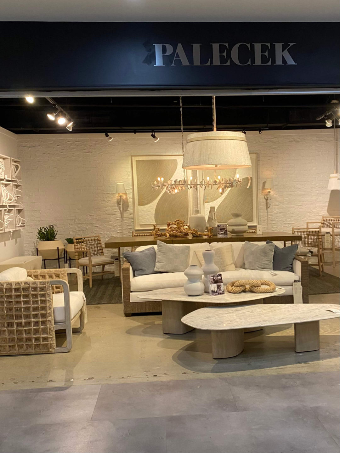
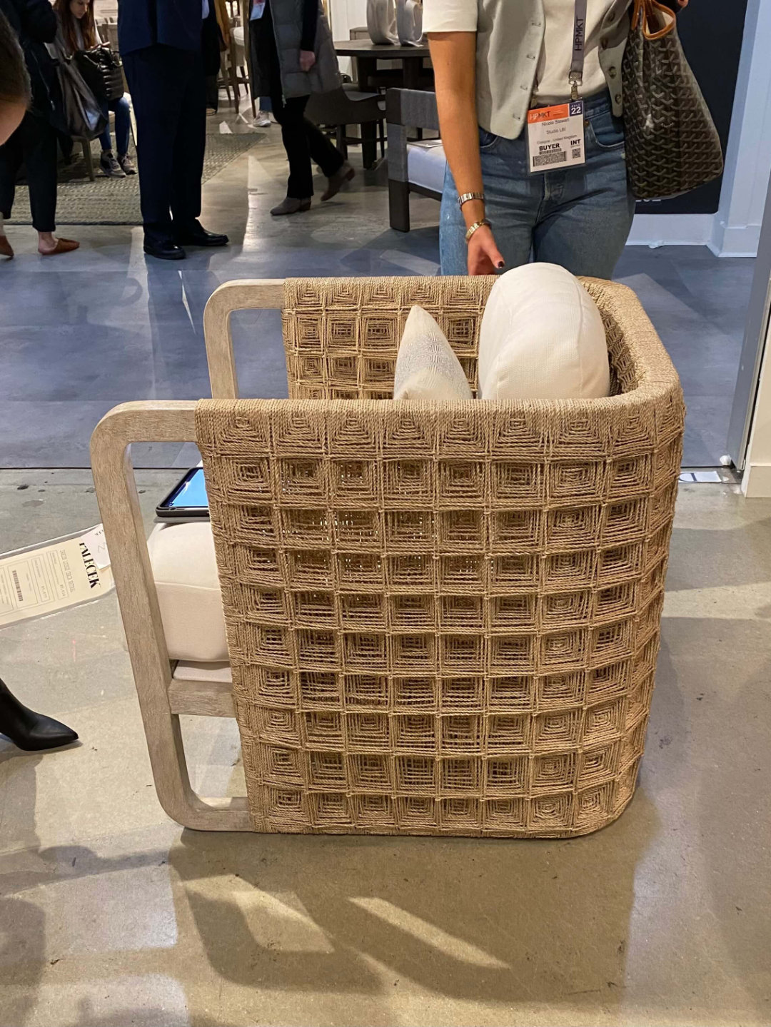
We’ve seen a lot of rattan on chairs in the UK over the last few years and it looks like its here to stay.  We also saw rope featured on lighting, chairs, mirrors and chest of drawers at Currey & Co.  Lots of natural rattan lighting at Visual Comfort and we loved seeing a rattan version our favourite Darlana fixture. We particularly liked the rope four poster bed and beautiful rattan chairs from Palecek.
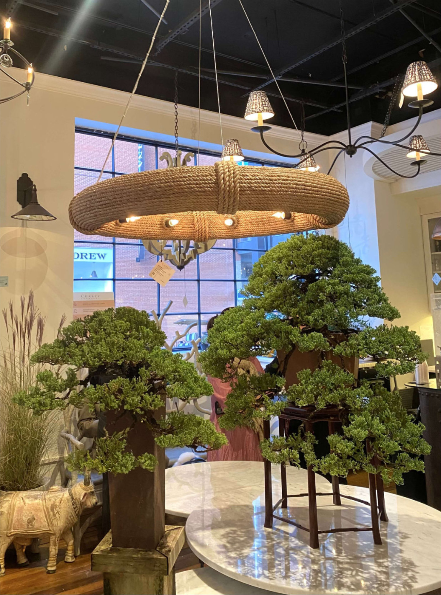
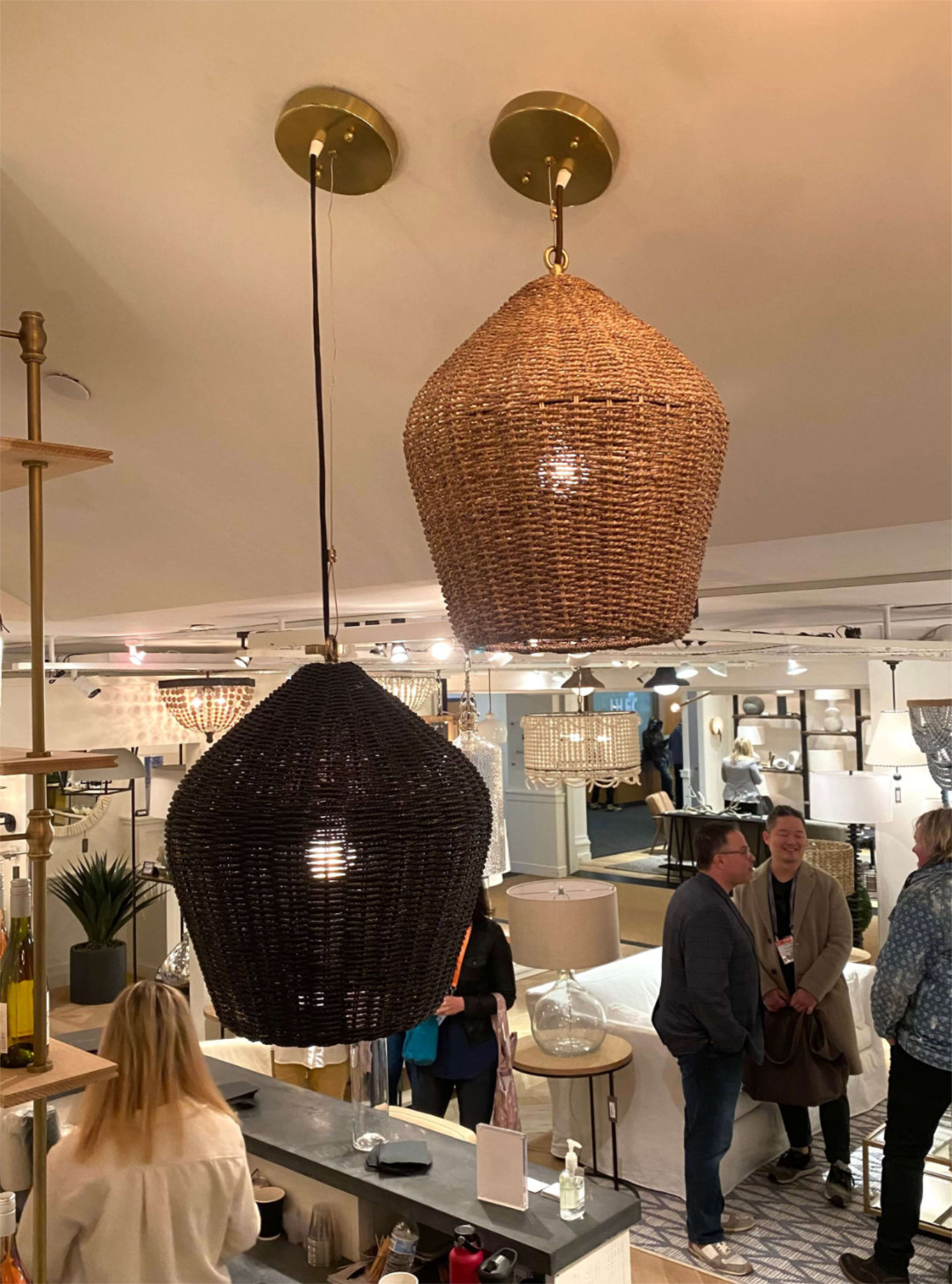
Rope and Rattan at Highpoint

Super comfy swivel chairs

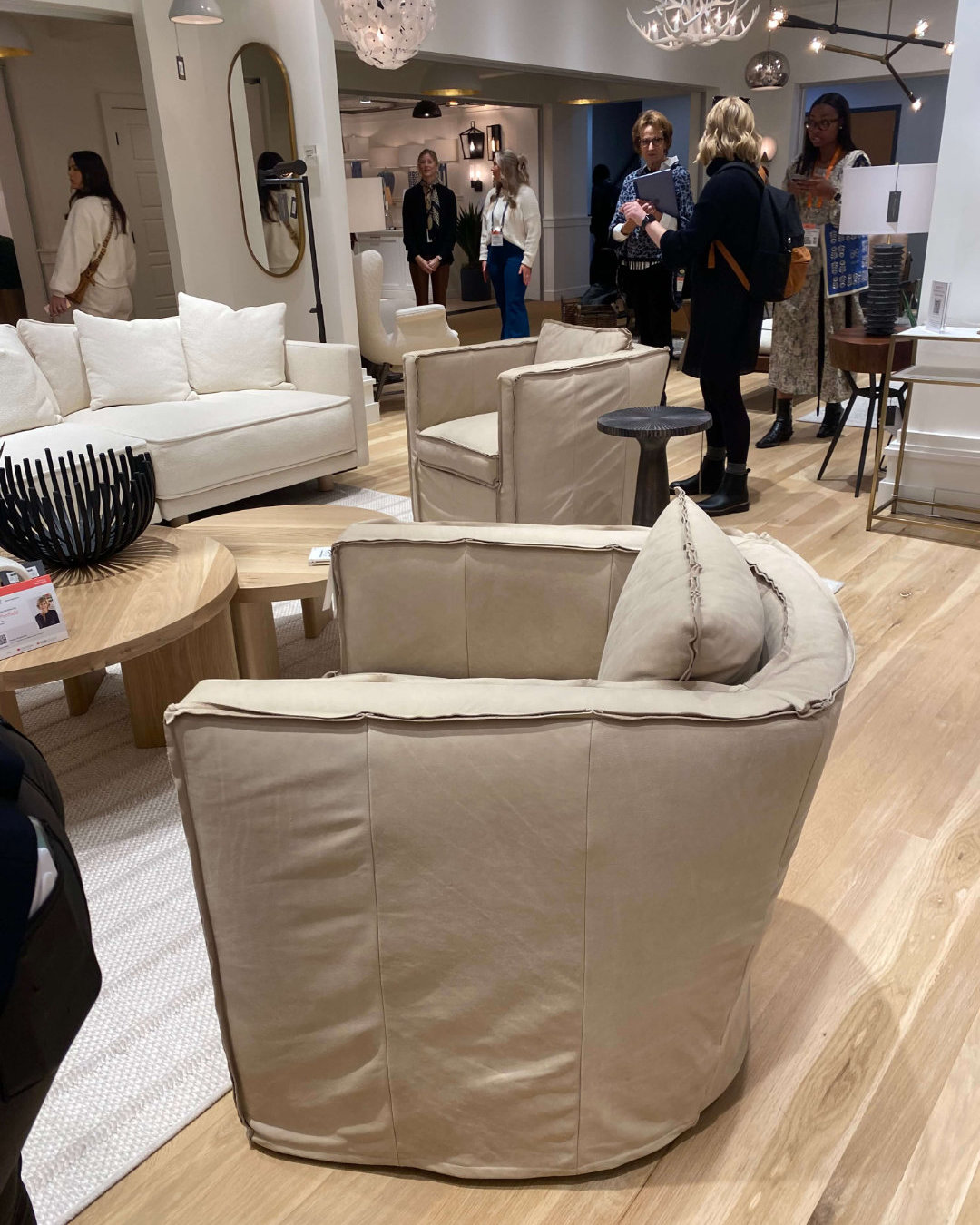
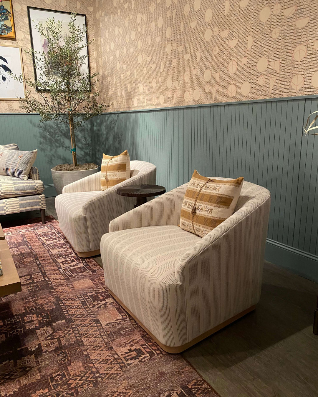
An unexpected theme that was repeated in nearly every showroom was swivel chairs. We have a small selection of swivel chairs in the UK, but nothing as stylish as these examples. Some of our favourites were from Regina Andrew, Vaughan and Interlude Home.

Swivel chairs work perfectly in open plan kitchen/living areas to enable socialising with every area of the room without getting a crick in your neck. Our houses are a lot smaller than the majority of American houses and much of our furniture tends to be tucked next to a wall to maximise floor space. As a result swivel chairs don’t work so well, but with open plan kitchens and living areas becoming more common place I think these are going to become a more realistic addition to the seating options we can specify. These chairs don’t look like swivel chairs and are exceptionally comfortable. A welcome break for sore feet too.
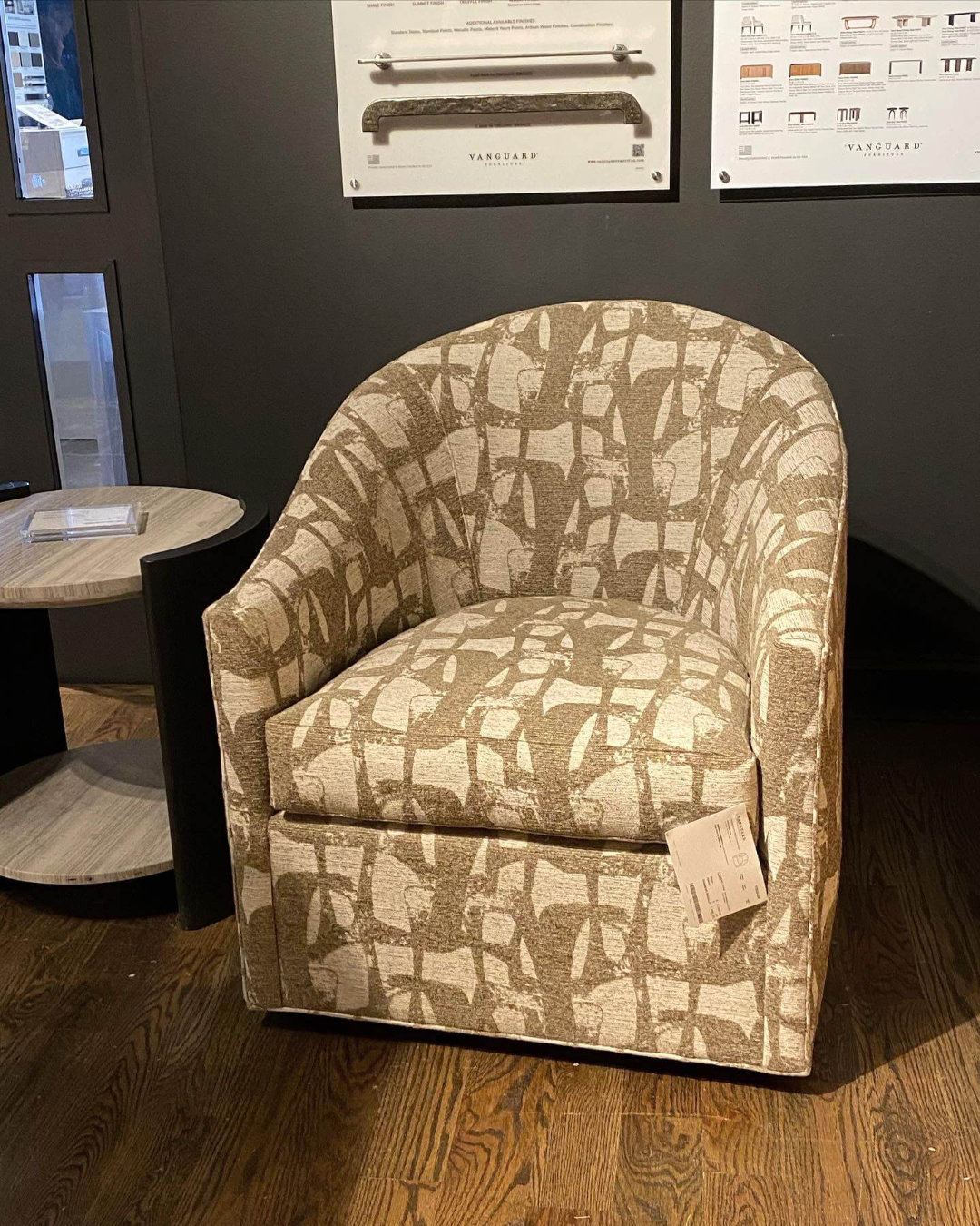
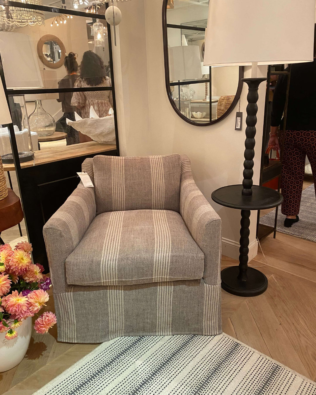
Swivel chairs

Vintage

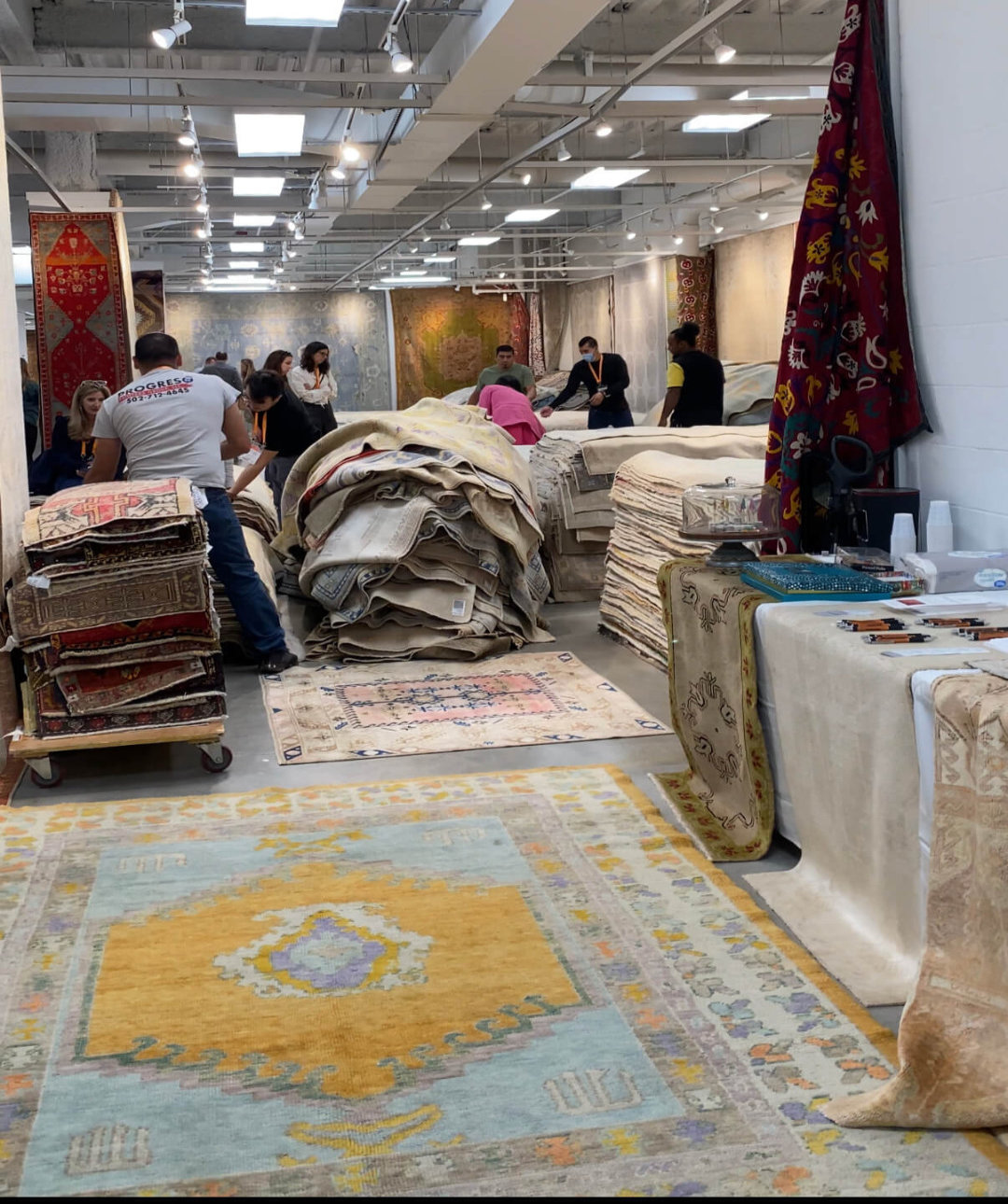
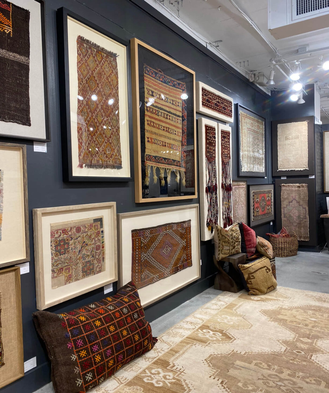
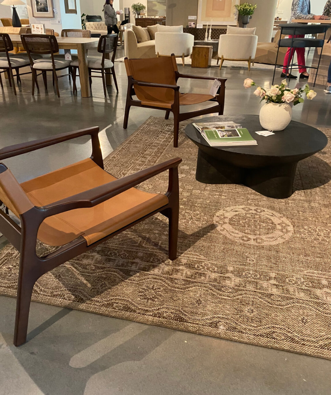
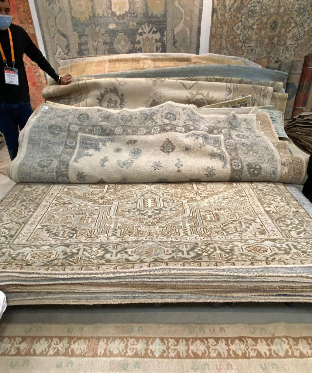
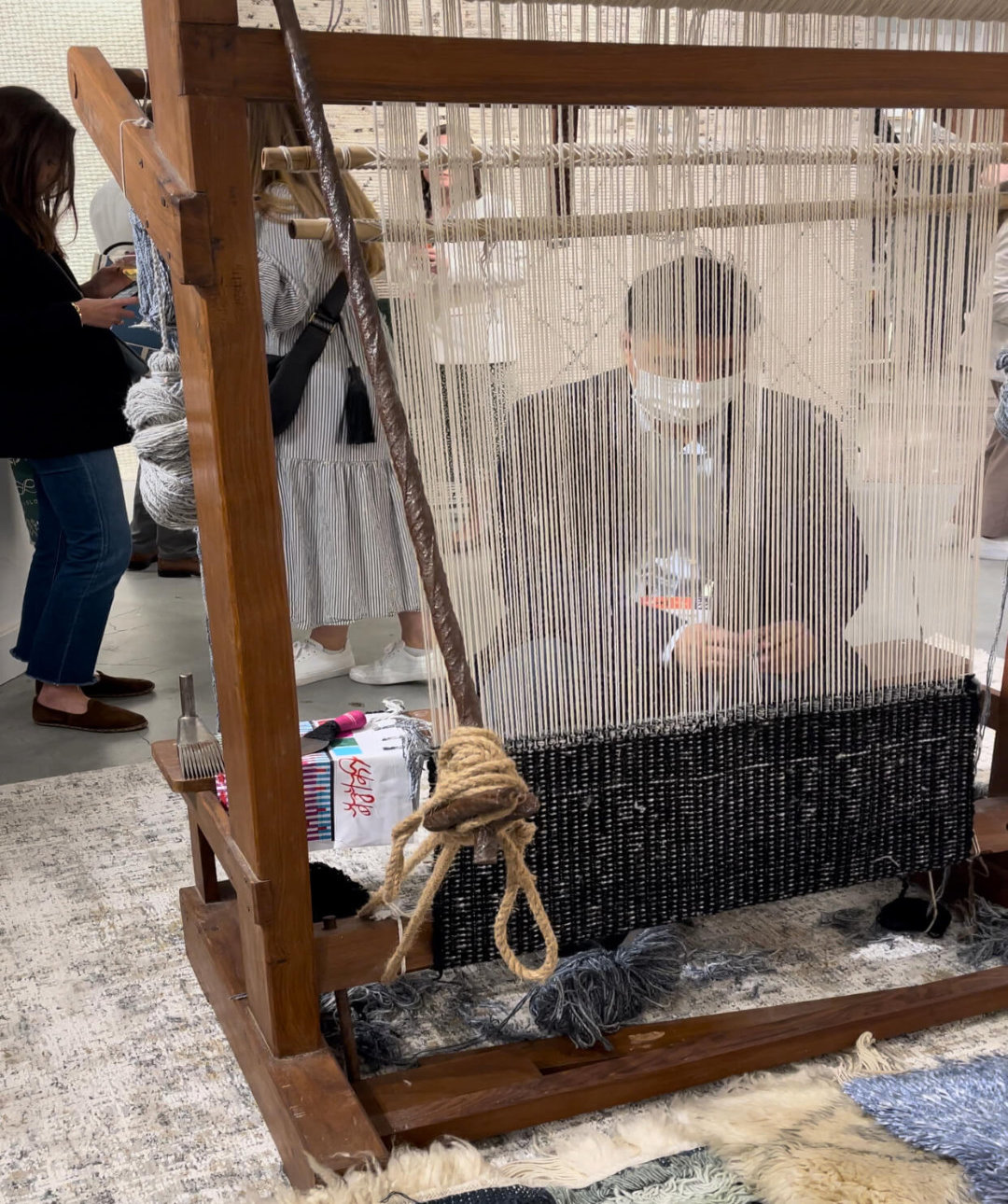
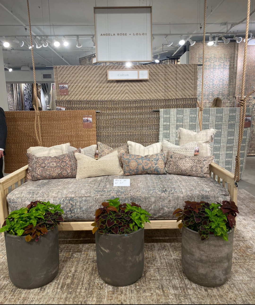
Another trend that has been with us for a while now is vintage.  Investing in key pieces that tell a story or “calculated vintage” as described by Lucy Searle from Homes and Gardens. I’m glad this is still important. We saw a lot of vintage rugs on our trip. I wish I could have packed a suitcase full of them. The desire for authenticity was evident in a number of showrooms, with a weaver based at the Loloi rugs showroom. Here they had an enormous selection of beautiful vintage rugs alongside much more practical lookalikes reserved for more heavily used rooms such as  kitchens, playrooms and boot rooms. The designs and motifs mimic the originals, often with interesting textures like the cloud pile by Loloi rugs, which was soft like velvet. One idea that I thought was lovely was repurposing vintage rugs into art and cushions. I love using discarded pieces and giving them a new lease of life.
Vintage trends

Buying quality and sustainability

Buying quality which is sustainable  ‘Buy well, buy once” connects us back to quality craftsmanship and that’s something we’re very keen to encourage in our projects. For most of our projects we try to keep our manufacturing within Scotland, with a keen eye on the provenance of the materials we use and their sustainability (even if it’s tough to see all the way back through the supply chain). Creating rooms with pieces that are unique and sourcing pieces that do as little harm as possible to our planet. We like source as much as we can from the UK and make as much as possible in Scotland to support British craftsmen and minimise the impact of transportation on the environment.
Categories
Uncategorized

Design trends for 2022

Our team shares mixed feelings about the idea of trends in design, but the truth is, our homes are ever evolving and often a reflection of what is happening around us. It’s always fun to watch how the patterns of material, form, and influences ebb and flow from year to year, and we’re excited to share a few things we can’t wait to incorporate more of in 2022.  

While we love light and bright spaces, the design pendulum is swinging back to traditionalism as we spend more and more time indoors and long for the feeling of comfort that timeless, warm elements bring to our spaces. This year, we’re encouraging our clients to welcome rich materials that bring depth to the home, and we’re excited to see a resurgence of traditional details in everything from architecture to product design. 

Here are a few design “trends” we’re anticipating this year: 

Playing with scale is always a great way to keep things interesting in design, and this year, we’re excited to see even more exaggerated proportions in everything from statement-making lighting to sculptural-like vases and artwork. 

Even proportions in hard finishes like tile and hardware can feel exaggerated and draw the eye to every detail, giving any interior a custom and thoughtful feeling. 

Pattern is going to be big.  While committing to a pattern can feel intimidating, there are countless ways to incorporate more patterns into your space that don’t involve covering your walls from floor to ceiling. Think patterned textiles, rugs, and even artwork! 

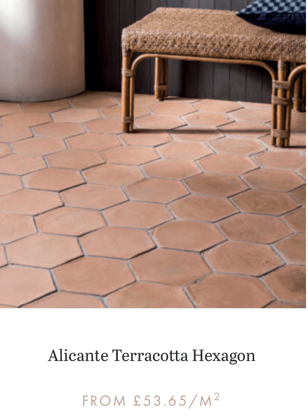
We also predict that more earthy colours of browns and tan, displayed in fabrics like leather or even in terracotta floors or walls.  Nature-inspired surfaces and accents—think marbles and mushroom shapes.  Essentially, anything that feels warm, welcoming and cosy.

Then, there’s the pandemic the reality is that our homes have become the main settings for our lives, not only where we sleep and socialise but also increasingly, where we work.  Every corner, and every object we’re surrounded by, must serve some sort of purpose. Perhaps it’s a functional one, but I think travel-inspired interiors will also be introduced to enhance our escapism.

Dual-Purpose Rooms

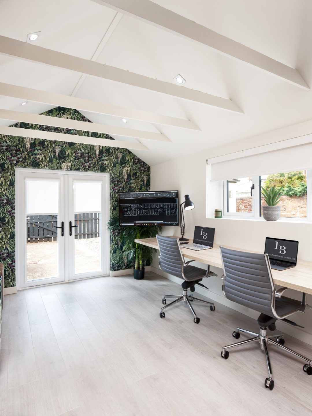
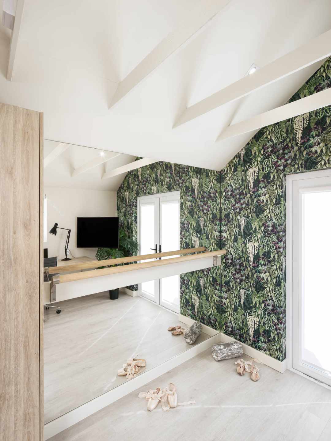
“As we get into another year of COVID variants, our living spaces continue to double as our work rooms.  The kitchen continues as the conference room and the farmhouse table is the new boardroom table. Garages turned into offices or a home gym, for somewhere to escape to.

A garage conversion by Studio LBI

Vintage and Sustainable Accents

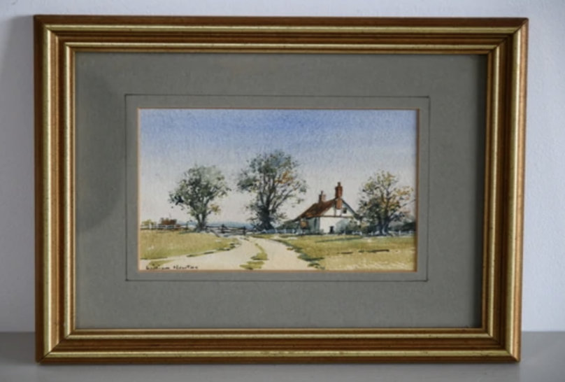
Whenever I can use vintage, I will. From a design standpoint, vintage is the protagonist of every room—it has the power to influence the storytelling and direction. But aside from their decorative propensity, these rare antiquities are stylishly sustainable. By repurposing the old and worn into something new, we’re reducing our footprint while bringing a rich sense of history and spirit into a space.


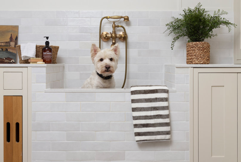
Utility/Dog shower designed by Studio LBI. Vintage accessories @Kernowfurniture.co.uk

Nature-Inspired Surfaces and Objects

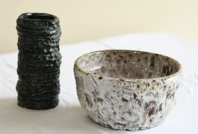
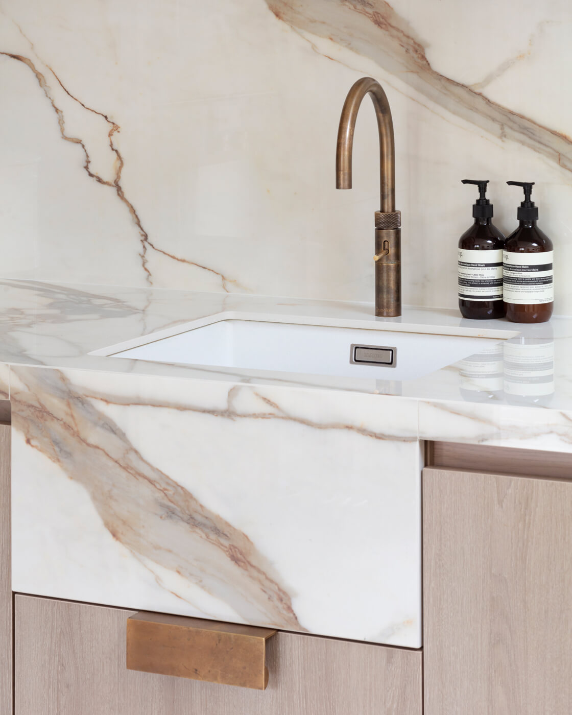
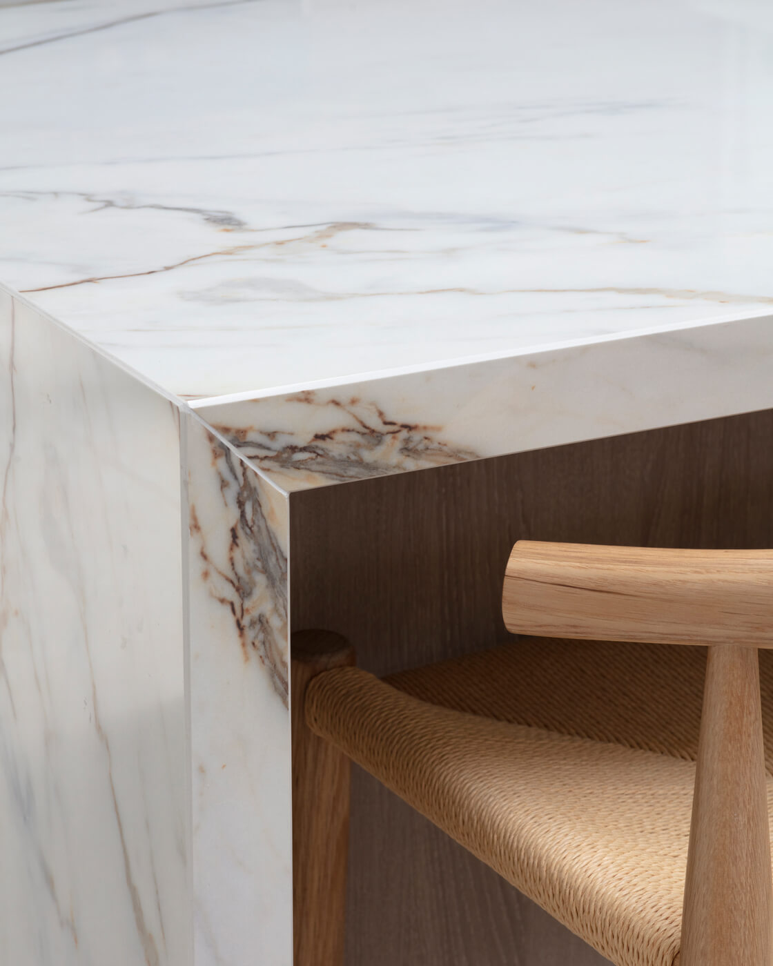
“With more time spent indoors than ever before, we’re all seeking to strengthen our connection with nature. This has simultaneously inspired a resurgence in natural surfaces—think stoneware, terracotta, marble, and travertine being used across the board from backsplashes to bathtubs, furniture, and decorative objects. The raw, porous, imperfect nature of these organic materials adds depth, soul, and visual intrigue while also mimicking the calming, restorative ambiance of the outdoors.

Softened kitchen furnishings 

We’re excited about seeing more furniture-like builds in the kitchen and living-space-like decor in the kitchen this year. We’ve been using artwork in kitchens for years, and we love incorporating lamps and other unexpected décor and finishes to soften the hard lines of kitchen cabinetry and appliances.

Warmer material & colour palettes  

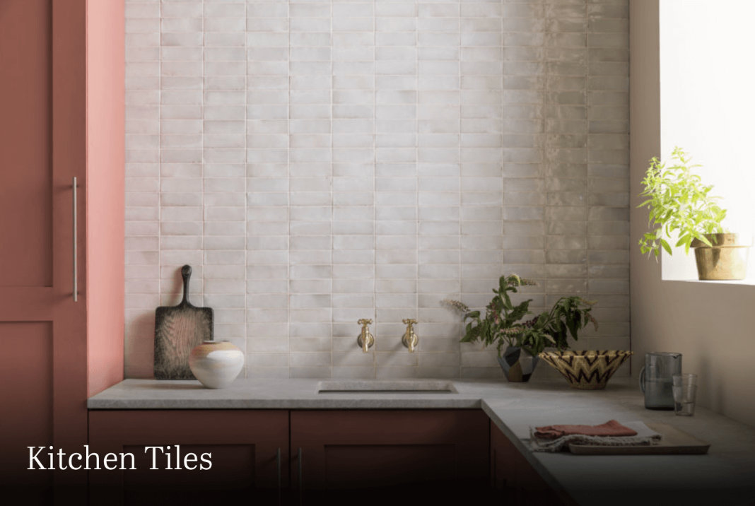
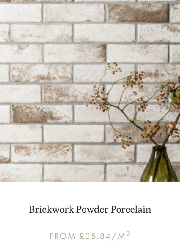
From terracotta to deep brown hues and warm natural stone and woods, we’re expecting to see even more warm material and colour palettes in 2022. After a few years of uncertainty in the outside world, these warm tones are comforting and inviting, encouraging you to sit down and stay a while.  Although warm and rusty tones are typically associated with autumn and winter months, we anticipate them having a year-round staying power as we continue to create spaces of refuge at home.

Images from Mandarin Stone

Pedestal dining tables 

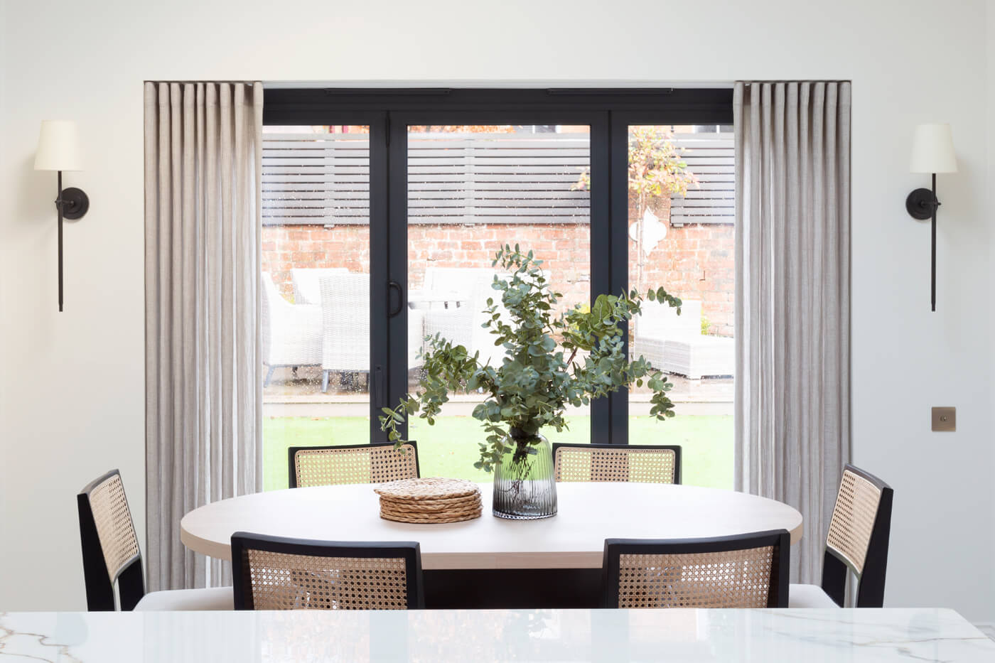
While pedestals aren’t a new trend, we’re seeing more and more people incorporate them into their spaces, and we’re all for it!  Pedestals can be a great way to add a new layer of material or texture in your home, fill an empty space, bring in height variation, or all the above!  We’re excited to see new variations on pedestal materials and colours, and we might even have a few to share in our upcoming collections for our new Studio LBI shop.

Categories
Uncategorized

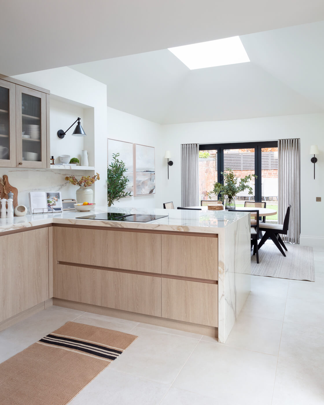
Designing your dream kitchen

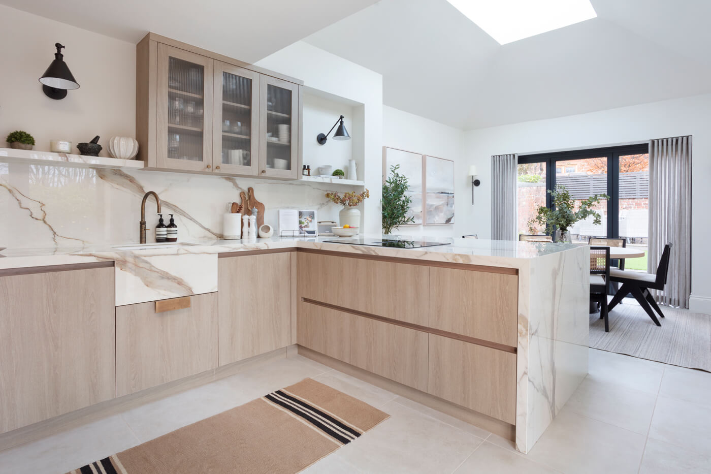
The kitchen is the heart of your home and working on a good foundation when planning your new kitchen is critical, whatever the size of your budget. In this blog I’ve put together some key elements to consider when making your design choices. I suggest that tackling the remodelling of a kitchen should always follow the same process and adopt the same design principles. The key steps are Inspiration, Aesthetics, Function and Planning.

Inspiration

The first important step is choosing the style of your kitchen.

I suggest gathering images for inspiration and use these images to guide the look you want to achieve and stay true to it until the end of the project.  I recommend saving ten pictures of kitchens you love and then working out which elements you like in each image as the platform for what follows. You then need to make sure your kitchen style flows with the rest of the house. For example, it is common to see an ultra-modern kitchen design in a traditional home and quite often it can be hard to make this design flow with the rest of the house. In my experience, it usually feels disjointed. If you are set on making opposing styles work and are installing a modern kitchen in a period property, I would recommend introducing traditional light fittings and marble to give it a classic twist.  

Aesthetics and Colour choice 

Always choose a palette that fits the space. Three colours are the rule, two main colours and one accent. Think about how they blend with nearby rooms and consider that too many colours can be overwhelming.  If you opt for an all-white kitchen, remember to add lots and lots of texture such as white herringbone tiles and white textured wood. If there is no contrast with textures or colour then your kitchen risks looking boring, adding brass handles can help warm up the design while adding contrast.

If you like grey then you can easily warm it up with brass. I like both polished and antique brass but this will be decided by the style you have chosen.

Kitchens are notoriously expensive and to achieve the “wow” factor, be bold and take calculated risks. Try not to ask people what they think unless it’s an interior designer. Stay true to what you love and don’t do it half-heartedly. If you like red then go for it. If you love pink, add pink but just remember the three colour rule. You might add red and white as your main colours and brass as your accent colour. Metal is also considered a colour, but if you add pale oak floor I would think of these as the same colour, so they count as one.  Contrast always makes things pop more. 

Function and Planning strategy

Budgets. Know where to splurge and where not to.  Handles can make a kitchen but shop around as you don’t always need to go crazy. If you want to splurge then I love Armac Martin and Joseph Giles handles and have used them on several of my projects in the past. You also need to understand the timings, terminology and materials. Do your homework as it will help when you start talking to trades. Weave back and forth through the design, double-checking your finishes and choices. 

Start with a rough floor plan then consider your lighting requirements. This is so important as lighting can make the room pop and creates an atmosphere. Consider lighting inside a cupboard, lighting under your units or adding wall lights to add character to match the chosen kitchen style. 

As to flooring, I like tiles and as I have a dog it’s easy to mop and works functionally. I also like the softness of wood, so would consider using this on kitchen units and furniture.  Apart from the aesthetics, you also need to consider the equipment you will need, like special ovens, microwave, ice maker and whether you want to cook with gas or electric.  Electric ovens now clean themselves, so this could be an important factor in choosing appliances!

Tricks that always work!

Always, always make the cabinetry higher, ideally up to the ceiling height. Taller is always better and scaling up makes a huge difference. Cabinetry looks personalised and customised when it reaches the ceiling. Smaller is cheaper, but size is something you don’t want to scrimp on as it will make your kitchen feel, bigger and grander. Tiling to the bottom of the cabinets is also a good way to add drama and impact. If something looks as if it lacks scale on your plans, then scale up. 

As mentioned before height works, especially if it draws your eye upward. Large pendants are always good over an island as a way of catching the eye. 

New builds are an excellent example of how to get this wrong. They usually take kitchens or bookcases to door height highlighting lower ceilings making the room feel smaller. By taking your cabinets to ceiling height you are tricking the eye by making it think the room is taller than it is. Another look I love is shelving over doorways.

The main takeaway is that bigger and taller will always look grander. 

Mixing it up!

Have fun. Not everything needs to match. Handles could be different on the kitchen island and your wall units.  You can mix brushed metals and mix shiny together, but never mix both shiny and polished.  Antique brushed brass with matt black works well.

Painting the upper and lower units in different colours also works well.  Mix your textures too. An all-white kitchen with a wooden slatted ceiling breaks the white up. 

Key points to remember, height, drama, contrast and scale up!  

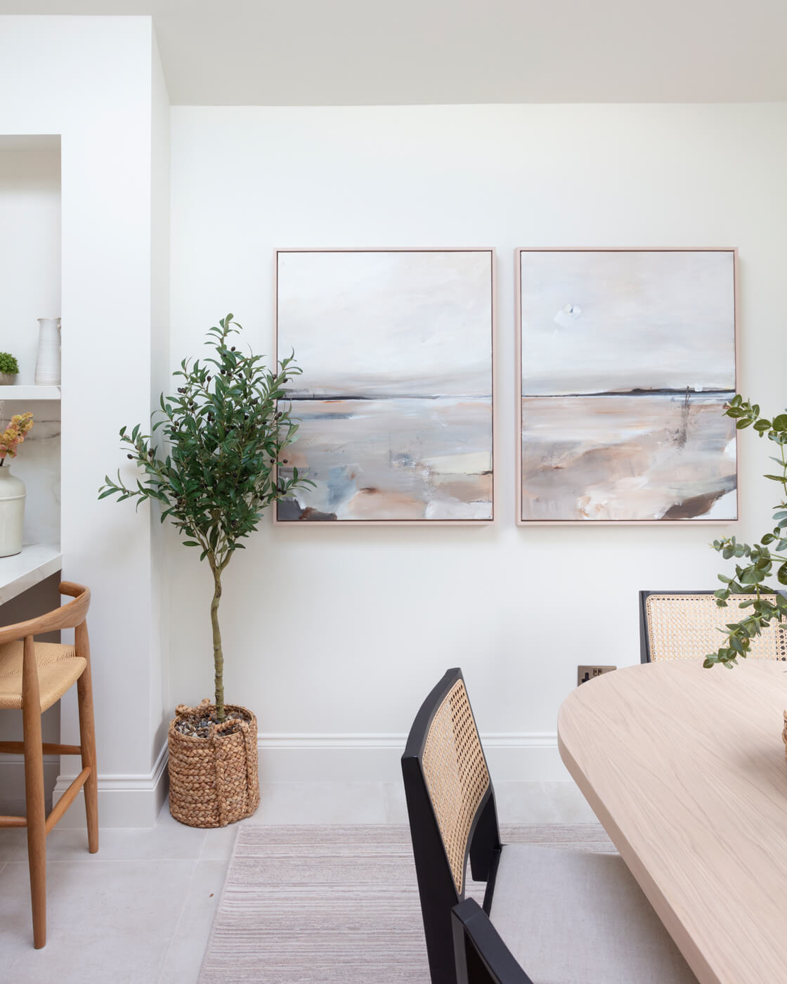
Finally, think beauty first, then functionality and finally add your accessories to personalise the kitchen.  Consider adding artwork to shelves or artfully positioning good quality wooden chopping boards.  Greenery is always important, fresh or faux. 

Too many times, I have gone into a home where the kitchen has been designed by an “off the shelf” kitchen company and it looks exactly that, exhibiting no individuality or character. So, my final tip is to think about what you want and demand it. After all, your kitchen is at the heart of your home. Make sure it reflects your personality as much as the rest of your home. 

Have fun! Louise